Positioned a grassroots consulting company as an authentic, trusted authority on community health
-
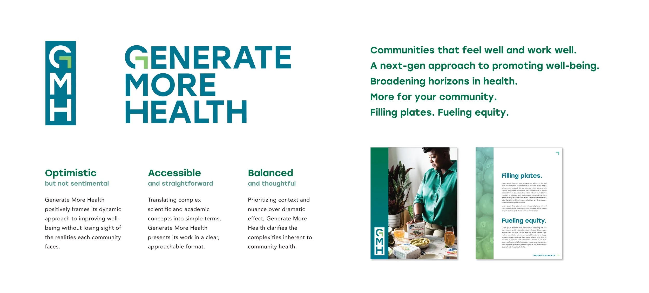
Brought clarity and focus to the brand, aligning around the internal pillars, promise, and voice and equipping the client with key messaging to convey its value
-
Explored a range of directions for the visual expression of the brand, culminating in a clean yet dynamic look and feel featuring oversized, sans serif fonts that evoke transparency and accessibility and a palette of blues and greens that meet in an ombré application